Hi, appearance can be so subjective so I only post this as a suggestion.
I like where the design of the interface has gone over time from a year or two ago, but I still find the shadows around fields and borders to be a bit heavy at times.
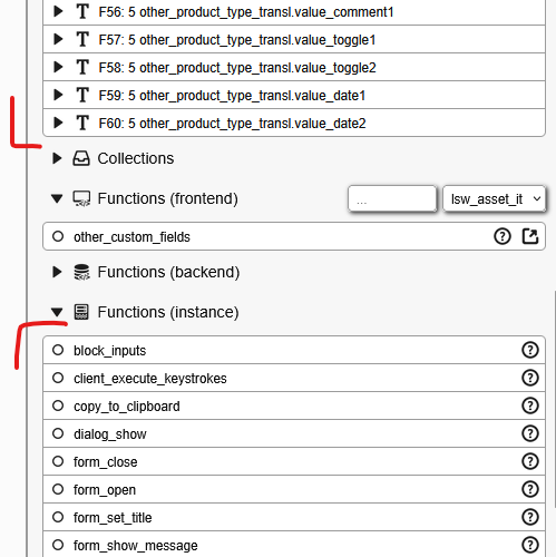
Particularly in the builder properties and content panels, with all the field nesting, the shadows and horizontal borders can build up and feel quite crowded together, eg: see shadows and borders stacking up on each other in this screenshot:

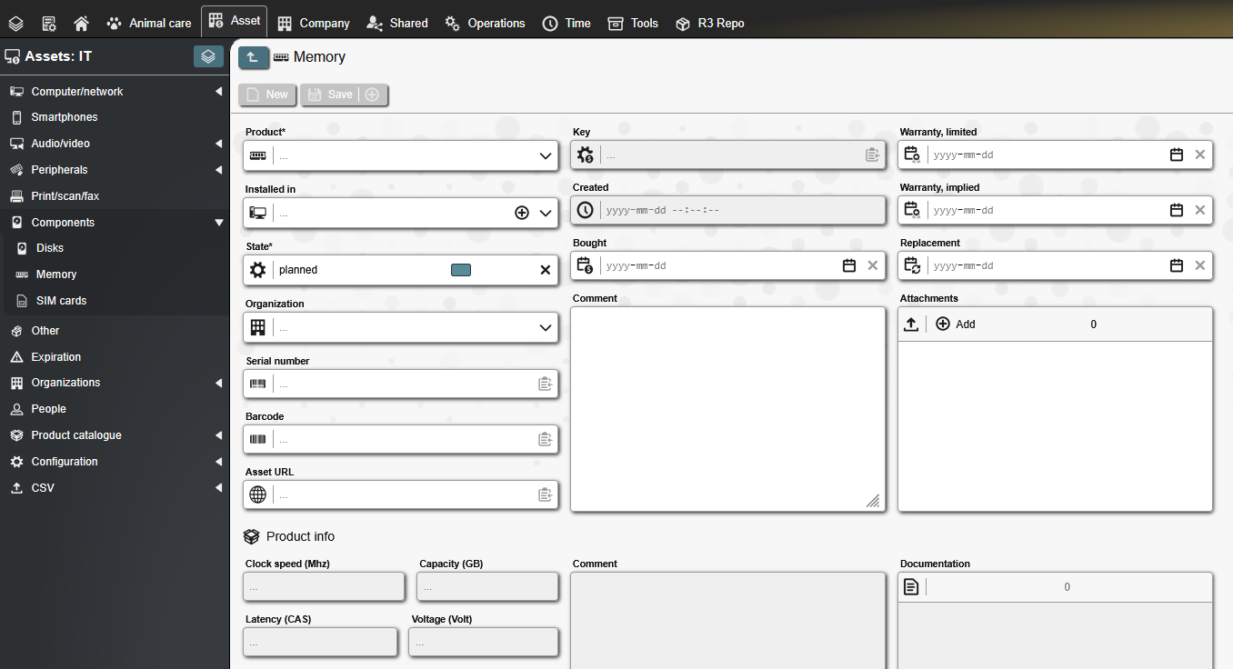
But also in front-end forms they sometimes feel too over-bearing:

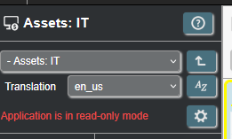
I like how the front-end functions placeholders without shadows sit against the grey background:

So I just tweaked a couple of CSS variables as a proof of concept to see if I could lighten the shadows without going too low contrast, as I know that is a criticised trend too (you still need to be able to see things!).
:root {

  --color-shade: #dedede;

  --shadow-input: 1px 1px 3px var(--color-shade);

  }
This will be a bit too light if you don't also use the "more" borders setting in the user preferences to give a border to the fields.
But I think the lighter, less blurred shadow helps everything to sit 'into' the page a bit better without feeling like its overwhelming when nested in the builder. Perhaps the 'not more' user preference still needs a faint border with this setup, and 'more' darkens it.


What do people think?
There are areas of the builder interface that don't seem to use that css variable, and the buttons/fields over on the main menu look they would need an inverse variable for a dark back ground shadow:
