YogiYang
With the current implementation, I think, we´ve found a better solution than deciding to show/hide things based on device type (mobile, tablet, desktop, etc.).
The way it works right now, is that a user chooses what they want to see (application titles, icons, etc.) in their personal settings. Then REI3 tries to meet these choices as best it can, based on the available screen space. So if the user switches devices or changes orientation of their mobile device (or even changes font sizes), all elements are checked and then dynamically adjusted.
If the user wants to see application titles, but resized the browser window slightly, the titles might need to be dropped. If they didn´t want app titles to begin with, REI3 has more space to work with for other elements.
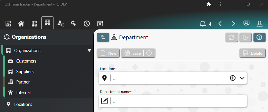
To demonstrate, here are 4 screenshots of the same browser window, getting smaller:


